|
|
|
History of Graphic Design Typography and Printing Pre-history to 19th Century |
|
The Incunabula Period
Before the invention of printing using moveable type, books were copied by hand, word for word, letter by letter, by scribes, generally onto parchment or vellum.
Obviously, this was an extremely laborious and time-consuming method, and the level of production was minimal -- not to mention the potential for errors during transcription. Later, the method of block printing was devised (i.e. in Europe, as this method had been used for centuries in the Orient) wherein the entire text for a page was cut into wood and thus printed, although even this method was rather labour-intensive as well. However, great care was often undertaken in the reproduction of books in both of these ways, and the pages were often subsequently "illuminated" with wonderful illustrations and ornaments. Some of the most beautiful books ever made come from the time before the invention of printing with moveable type, and the first books which were printed using this latter method endeavoured to emulate that beauty and form.

 Celtic Book Designs The 7th to the 9th century was the heyday of the "illuminated manuscript". Production of these works took place in the monasteries scattered across Europe. These religious retreats were the repositories of those texts of Greece and Rome which survived in Europe. They were also the seats of the intellectual life of Europe during the Middle Ages. Monks in the monasteries made copies of the books in their care - both religious and secular manuscripts. However, they did not contribute much more to the advancement of that intellectual tradition, because they were not engaged in thinking about the relationship between the works in their care and the world outside the monastery.
During this time, the production of Bibles was the place where the arts of the monastic scribes, and later lay artists, flowered. It was here that the most elaborate and beautiful illumination found its outlet and the manuscript books from this period represent the height of the art of decoration.
One of the most beautiful examples of an illuminated manuscript is the Irish Book of Kells: "a large-format manuscript codex of the Latin text of the gospels". Other books include The Book of Durrow and the Lindisfarne Gospels
The most important thing about the manuscript books of this period is that they were objects of religious veneration. They were seen as consecrated objects. Their creation was an act of religious devotion. The monks who sat for years, working on single chapters of the Bible, were not reproducing books. They were making the word of God manifest in the world.
The style of these books is very different from anything we are used to reading. They are not meant to be a collection of words that convey information from an author to the reader. Their primary function is to serve as decoration which pays tribute to the word of God.
In an illuminated manuscript, the complexity of the decoration was intended to mirror the complexity of the biblical passages the decoration illustrates. Just as Biblical text is open to many different interpretations, the illumination of that text was intended to pose the same allusive and meditative possiblilities.


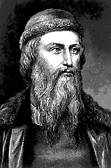
Printing in Germany: Gutenberg and Durer Johann Gutenberg Gutenberg’s invention sparked many religious revolutions with his invention that allowed the common man to posses a Bible for his own interpretation. The printing press allowed knowledge and ideas to be passed from one man to the other and paved the way for schools and media.
A Printer's Mark: Fust and Schoeffer A Printer's mark was a shorthand version of a more complete trademark called a printer's device. The device was a block print picture. The printer's mark was a simple little line drawing that reminds us of the device. For example, one mark looks like a script letter "A" with three stars around it. The printers who used it were Johann Fust and Peter Schoeffer. Their device was a pair of shields. The mark appeared on one of the shields in the device. Fust was the wealthy goldsmith who bankrolled Gutenberg. When Gutenberg went bankrupt, Fust claimed the business for himself. So this mark takes us all the way back to 1457, and practically back to the birth of modern printing.  ALBRECHT DURER Impressive though others may be, the great German artist of the Northern Renaissance is Albrecht Dürer (1471-1528). We know his life better than the lives of other artists of his time: we have, for instance, his letters and those of his friends. Dürer traveled, and found, he says, more appreciation abroad than at home. The Italian influence on his art was of a particularly Venetian strain, through the great Bellini, who, by the time Dürer met him, was an old man. Dürer was exceptionally learned, and the only Northern artist who fully absorbed the sophisticated Italian dialogue between scientific theory and art, producing his own treatise on proportion in 1528. But although we know so much about his doings, it is not easy to fathom his thinking.
"I hold that the perfection of form and beauty is contained in the sum of all men."

  Printing in Italy: Francesco Griffo and Aldus Manutius
Aldus Manutius -
Venetian scholar, who became a publisher and printer when he founded the Aldine Press in 1495.
He introduced personal or pocket editions of the classics in Latin and Greek that all could own, as well as works by contemporaries Pietro Bembo and Erasmus. His typefaces were all designed and cut by the brilliant Francesco Griffo, a punchcutter who created the first roman type cut from study of classical Roman capitals.
Type designs based on work used by Aldus Manutius include Bembo and Poliphilus (below).
 

Click here for more on THE LEGACY OF ALDUS MANUTIUS AND HIS PRESS For more history on printing, click here. |
|
|
|
Home ||
Invention of
Writing ||
The Alphabet
|
|
. : : ART 153 Project HFCC : : . |
|
 The Latin word incunabulum (plural incunabula, and often anglicized as incunable) literally means cradle, and more loosely refers to the infancy, birthplace or origin of something. It is most often used in reference to early printed books, and in this sense an incunabulum is further defined even more specifically as being a book printed using moveable type prior to the year 1501AD.
 (Johann Gutenberg holding his forty-two-line Bible, right) Around 1455, Johann Gutenberg, a resident of Mainz (now Germany), and his partners produced a Bible on their machine for printing-and changed society forever.
Gutenberg worked as a goldsmith and gem cutter as a young man and had learned about metallurgy. Gutenberg first designed type that would space evenly on a page and also look pleasing to the eye. His first type was cast of the metals lead, antimony, and tin and consisted of two-hundred and ninety separate symbols. Gutenberg also had to find an ink that would not fade or be to thick and came up with the combination of boiled linseed oil and soot. Gutenberg adapted a wine press for printing that was waste high and had a rolling tray so that he could slide the paper in and out. The press would also enable him to also squeeze water out of the damp paper while printing at the same time. The Gutenberg Bible, printed in 1455, was the first Bible ever printed and the first book ever printed in Europe. Gutenberg printed two-hundred copies of this book which was known as a 36-line Bible for the number of lines that were on each page.
(Johann Gutenberg holding his forty-two-line Bible, right) Around 1455, Johann Gutenberg, a resident of Mainz (now Germany), and his partners produced a Bible on their machine for printing-and changed society forever.
Gutenberg worked as a goldsmith and gem cutter as a young man and had learned about metallurgy. Gutenberg first designed type that would space evenly on a page and also look pleasing to the eye. His first type was cast of the metals lead, antimony, and tin and consisted of two-hundred and ninety separate symbols. Gutenberg also had to find an ink that would not fade or be to thick and came up with the combination of boiled linseed oil and soot. Gutenberg adapted a wine press for printing that was waste high and had a rolling tray so that he could slide the paper in and out. The press would also enable him to also squeeze water out of the damp paper while printing at the same time. The Gutenberg Bible, printed in 1455, was the first Bible ever printed and the first book ever printed in Europe. Gutenberg printed two-hundred copies of this book which was known as a 36-line Bible for the number of lines that were on each page.
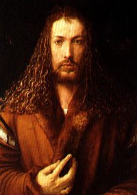 ALBRECHT DURER, perhaps the greatest German artist of the Renaissance era, began his career in the Imperial Free City of Nuernberg with his father, a Hungarian goldsmith who had emigrated to Germany in 1455. Despite his goldsmith origins, however, by 1484 Durer had already begun painting. In 1486 he was apprenticed to the painter and printmaker Michael Wolgumut and began to work with woodcuts and copper engravings as well.
The 16th century saw the emergence of a new type of patron, not the grand aristocrat but the bourgeois, eager to purchase pictures in the newly developed medium of woodcut printing. The new century also brought an interest in Humanism and science, and a market for books, many of which were illustrated with woodcuts. The accuracy and inner perception of DürerŐs art represent one aspect of German portraiture; another is seen in the work of that master of the court portrait, Holbein.
ALBRECHT DURER, perhaps the greatest German artist of the Renaissance era, began his career in the Imperial Free City of Nuernberg with his father, a Hungarian goldsmith who had emigrated to Germany in 1455. Despite his goldsmith origins, however, by 1484 Durer had already begun painting. In 1486 he was apprenticed to the painter and printmaker Michael Wolgumut and began to work with woodcuts and copper engravings as well.
The 16th century saw the emergence of a new type of patron, not the grand aristocrat but the bourgeois, eager to purchase pictures in the newly developed medium of woodcut printing. The new century also brought an interest in Humanism and science, and a market for books, many of which were illustrated with woodcuts. The accuracy and inner perception of DürerŐs art represent one aspect of German portraiture; another is seen in the work of that master of the court portrait, Holbein.
 Francesco da Bologna, surname Griffo, was a late fifteenth century Venetian punchcutter. He worked for Aldus Manutius cutting early italics, music types and the first roman to appear natural to our eyes. Griffo designed and cut all types for the Aldine Press.
After the death of Manutius in 1515, Griffo returned to Bologna where he printed some of his own editions until his own death in 1518 or 1519, when it is thought he was hanged for killing his brother-in-law.
Francesco da Bologna, surname Griffo, was a late fifteenth century Venetian punchcutter. He worked for Aldus Manutius cutting early italics, music types and the first roman to appear natural to our eyes. Griffo designed and cut all types for the Aldine Press.
After the death of Manutius in 1515, Griffo returned to Bologna where he printed some of his own editions until his own death in 1518 or 1519, when it is thought he was hanged for killing his brother-in-law.