|
|
|
History of Graphic Design Typography and Printing Pre-history to 19th Century
|
|
Simon-Pierre Fournier Le Jeune - Sept. 15, 1712-Oct. 8, 1768
French engraver and typefounder particularly noted for decorative typographic ornaments reflecting the Rococo spirit of his day.
Trained as an artist, at 17 he went to work in a typefoundry, where he learned to cut punches and to engrave ornaments. He set up his own typefoundry in Paris in 1736. He designed many new characters, and the fame of his foundry.
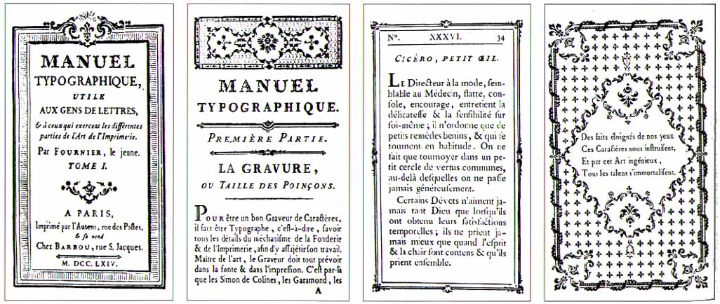
Fournier devised the first point system for measuring and naming sizes of type in 1737. He designed a number of typefaces and many typographic ornaments. He was the author of Manuel typographique (2 vol., 1764–66).
He is credited with introducing the point system for standardizing type sizes. His Manuel Typographique, published in 1764, illustrates a French two-inch scale divided into 144 points. Fournier then assigned a fixed point size to his various typefaces.
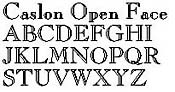
  Rococo Style - An eighteenth century art style which placed emphasis on portraying the carefree life of the aristocracy rather than on grand heroes or pious martyrs. Love and romance were considered to be better subjects for art than historical or religious subjects. The style was characterized by a free, graceful movement; a playful use of line; and delicate colors. Jean-Antoine Watteau (French, 1684-1721) is often referred to as the greatest of the Rococo painters, and his painting of the Embarkation for Cythera demonstrates the elegance of this style. The Rococo is sometimes considered a final phase of the Baroque period. William Caslon - 1692-1766, An Empire of Typefounding Caslon started work as apprentice to a London gunsmith, and set up his own business in 1716 engraving gunlocks and bookbinding tools. In 1720 William Bowyer the elder took him to see the respected James foundry, and subsequently helped Caslon set up as a type founder himself. His great reputation stems largely from his specimen of 1734, showing types that were (and often still are) reckoned to be superior to the Dutch types that inspired them. Indeed, his success meant the English reliance on Dutch types came to an end. He cut many non-Latin types (including Greek, Arabic, Hebrew, Coptic and Armenian) and some beautiful ornaments. His types were just as highly regarded in colonial America, and the Declaration of Independence was set in Caslon. His son, William Caslon II, took over the business upon his death in 1766.
John Baskerville - Jan. 28, 1706-Jan. 8, 1775 Characteristics:
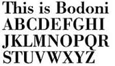
Giambattista Bodoni - Bodoni's distinctive characteristics make it an easy typeface to identify:
While not very readable in small sizes or in long text passages, Bodoni lends a striking visual quality to text. It requires more generous spacing than most types, even in larger sizes.
Sources for this page are found on this link: An Introduction to Type |
|
|
|
Home ||
Invention of
Writing ||
The Alphabet
|
|
. : : ART 153 Project HFCC : : . |
|
 Mid-eighteenth century British punchcutter and typefounder, who solidly established British typefounding with well-crafted copies of earlier Dutch designs.
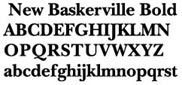
 English designer of type and printer. He and Caslon were the two great type designers of the 18th cent. in England. He began his work as printer and publisher in 1757 and in 1758 became printer to Cambridge Univ. Baskerville's first volume was a quarto edition of Vergil. His type faces introduced the modern, pseudoclassical style, with level serifs and with emphasis on the contrast of light and heavy lines. This style influenced that of the Didot family in France and that of Bodoni in Italy. Books printed by Baskerville are typically large, with wide margins, made with excellent paper and ink. His masterpiece was a folio Bible, published in 1763. After his death his wife operated the press until 1777. Then most of his types were purchased by Beaumarchais and were used in his 70-volume edition of Voltaire. The matrices, long lost, were rediscovered and in 1953 were presented to the Cambridge Univ. Press. Among Baskerville's publications in the British Museum are Aesop's Fables (1761), the Bible (1763), and the works of Horace (1770).
 Giambattista Bodoni of Parma, Italy, designed and cut his typefaces at the end of the eighteenth century. The Bodoni types were the culmination of nearly 300 years of evolution in roman type design, in which fine hairlines contrast sharply with bolder stems, and serifs are often unbracketed. Bodoni is recognized by its high contrast between thick and thin strokes, pure vertical stress, and hairline serifs.